
For project 3, I prepared an A3 sheet demonstrating the director's personality and the type of art to be exhibited at the gallery. Below is the text and images in blog form.
The art director: The director of the gallery is an art historian who has been widely published and is interested in theories of popular culture (cultural studies). Previously she worked as a university academic in an Art History department, writing on contemporary globalisation and cultural identity. She completed a PhD on the topic of Superflat art and has a history in printmaking. She has since left academia due to the success of her gallery and works full-time with the artists and their exhibitions. The prints editioned at the gallery play with the notion of mass-production that is also exclusive craft that is only available for purchase at her gallery.
Lifestyle: She lives alone and researches art and culture extensively which requires a small library or nook in either the gallery or her apartment. Her other requirements include room for her own personal art collection, comprising mostly of prints. Her hobbies include printmaking and film. She is in her 30s and has a circle of artist friends who visit to discuss art and edition collaborative works. She also hosts casual gatherings for pop cultural discussions or film screening in the gallery below.

An example of a small printing press which is her hobby and is also included in the gallery workshop.


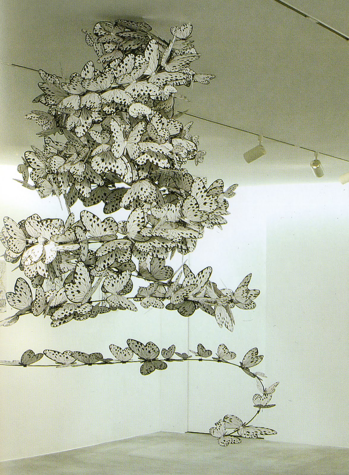
Two examples of the Superflat art that she is interested in and which was the subject of her PhD.

An example of her interest in popular culture taken from a 1950s Japanese film. She regularly holds film screenings and talks at the gallery.
The art: The artwork shown in this gallery is by emerging playful artists. The curator is interested in popular culture which forms the themes of some of the works. The works displayed range from painting, drawing and prints to sculpture and installation. Most mediums are exhibited. The uniting theme of the gallery is a play with the concept of high art. Artists’ intentions include the idea of fun at exhibitions, happiness from art, and the informal interaction of the art with the public. Also present is the notion that ‘art is everywhere’ including in commercial artwork. Many of the artists included have been influenced by
Superflat which is inspired by Japanese consumer culture such as graphic art, animation, pop culture and fine arts.
The workshop attached to the gallery includes screenprinting and lithograph printing facilities, which play with the idea that these commercially inspired artworks can be produced as editions that celebrate the mass production of the work. These mediums were chosed because of their commercial qualities.

This artwork employs a popular motif in Japanese culture - Hello Kitty - and comments on the artistic significance of this branded figure.


The hanpanda series (half panda) is based on the character branding of Sanrio and San-X varieties amongst others.

This is an example of the gallery drawings that are unique to this particular gallery. The subject is fun and simple.


The two artworks above adapt the famous Gundam robots into paintings - the first comments on warfare and the second relates Gundam to traditional Japanese screen paintings.

This is an example of an installation dealing with the life cycle. The other parts of this exhibition includes a wolf made of mirror shards and other drawings.
 The model helped to visualise the main entrance and gallery and also problems with the facade.
 This view is from the back entrance into the gallery.
 The second level plan shows the open circulation for the director and a place to entertain friends. There is an intimate living space at the entrance, a narrow gallery landing then an open plan kitchen and finally the study, bedroom and bathroom.
 The section below shows the four levels in the gallery including the sunken main gallery and the elevated small prints room. The visitors ascends and descends levels to enable them to appreciate different types of works. The circulation in the director's apartment is one of ascending low levels from the staircase to the study, passing several rooms that encourage open discussion and a free atmosphere.
 Here is an old sketchup draft of the gallery - the dimensions need to be changed for all drawings and models due to an error in scale.
 In section, the most light enters through the roof skylights and down through the stairwell. Light also enters through the glass shopfront window facing the street. The gallery is protected from direct sunlight by low windows in order to not damage the artworks.


 House N: Sou Fujimoto
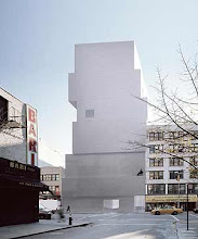
 Atelier Bow Wow House & Atelier


 An example of a small printing press which is her hobby and is also included in the gallery workshop.


 This artwork employs a popular motif in Japanese culture - Hello Kitty - and comments on the artistic significance of this branded figure.


 This is a view of the wings from the stage. The deep walls of the wings symbolise the final barrier between the daytime existence of the actors and their artificial performances. The angled windows in the wall symbolise chinks in the curtains and direct the artificial stage light into the ramp and passageway where the actress and her lover prepare for the performance. The light reminds them of the transformation into character ahead.
 From this angle, the entrance to the actress's room and the public corridor can be seen. The actress's bridge from the dressing room to the wings is separated from the ordinary bustle of backstage so that she and her lover can go through a series of reflections and thought processes on their way to the stage.
 This view highlights again the bridge's role in the theatre. The lover's ramp has a low glass railing that allows him to note that they are in theatre where the magic that he perceives is created. Then he can also take this knowledge to appreciate his actress as she prepares for her role.
 This top-down view shows the voids in the model - from the direct link between the dressing room and the wings to the open passageway with its overhead bridge. This openness is part of the theme of the awareness of between backstage and stage, from private to public and from nature to artifice.
 Finally, here is a closer view of the dressing room entrance - the top of an ascension into self reflection, private space and the privilege for the lover of attending the performance from the perspective of the theatre actors and actresses.


 The below photo was also part of the presentation and shows the use of an artificial light to express this light pentration.


 Here is the presentation of the section and plan for the building. In the presentation, the drawings were too small to be clearly legible so I have included larger images below. The parti of this building is the idea that the actress and her lover approach the stage wings through two different physical and intellectual paths. The actress is immersed in the transition into her character as she descends into her closed in path, and her lover can watch this transformation as he ascends towards his privileged seat in the wings, all the while being able to see the backstage activity on his left hand side.
 The dressing room and wings are located above the bustling backstage corridor, and are joined by a bridge that allows the actress and her lover to experience their separate journeys in a quieter, more reflective environment.
 The final presentation included the three most influential images of contemporary buildings from my research as well as three of the most inspirational images of theatres and an example of a boudoir from the 1920s. I wanted to include these images to provide a context for my design that was both technical and theoretical. The atmosphere of the theatre, the materiality and the intimate view of the boudoir were themes that I wanted to play with.

