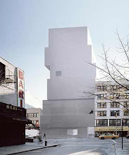
 The first set of drawings for the final presentation was a series of elevations showing the exteriors of the gallery and workshop. The final presentation drawings were at scale 1:100 and were printed on A2 paper. The elevations included varied line widths and shadows to show depth.
The plan drawings were more detailed than my past drawings, with a higher level of inhabitation than previous projects, which was realised through the inclusion of more furniture and artworks. The precedent for these drawings was the plans and sections by the Japanese architecture firm, SANAA.

The section drawing and vignettes include a similar level of detail to the plans. The section included a printing press in the workshop, which is a key theme for the project, representing low art and repetition.
 The poches of the plan drawings had to be scanned in B&W due to their size and the lack of A2 color scanning facilities at the printshop. However, the sense of light and atmosphere is still captured to an extent. The drawings show that the two main gallery areas and the focal stairwell are major sources of light.
The poche plan and section of a room (the main gallery) demonstrates the filtering of light through the glass shopfront and glass floor above the awning. The section poche shows the major lit spaces of the front gallery, the upstairs apartment and the stairwell. The light in the downstairs gallery core is mostly artificial, with a low level of diffused natural light near the floor, where the water outside reflects the light upwards.
The vignettes below attempted to capture particular interior spaces. This first vignette is taken from the workshop and reiterates the key idea of the printmaking editioning process and its connection to Superflat ideas of low art and mass media.
 The vignette below is of the gallery owner's private gallery on the large landing leading into her apartment. The close proximity of the artworks due to the size of the space allows the viewer to interact closely with the works when entering or leaving the apartment.
This vignette emphasizes the ascension from the spacious, cantilevered kitchen into the raised tatami room, which is represented in black to emphasise the space. The tatami room, which is used for study and for quiet entertaining, is the final upward space in the process of travelling through the apartment length to the private spaces.
 The main gallery entrance in this vignette shows the visual connection between the largest gallery and the print shop which provides the gallery's income. This openness is important because of it direct link with the works and the locally editioned 'sister works' made by the artists.
The vignette below shows the small prints room as seen from the second gallery. The small prints room is designed on a smaller scale in order to facilitate a closer viewing of the smaller works.


No comments:
Post a Comment