 The image above is an aerial view of the site which shows the glass street facade, the three large skylights, the back courtyard and the workshop. This view shows the building's relationship to the neighbouring buildings as well.
 This view shows the key feature of the stairwell. It also shows the key spaces of the apartment, the courtyard, the workshop and the main gallery. The circulation through the apartment is clear in this image - moving from the stairs, through the public rooms and then towards the private areas.
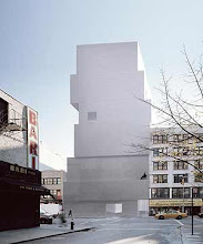
This view shows the street view of the building. It was intentionally designed to stand out from the neighbouring buildings in terms of height, colour and texture. A path runs between the gallery site and the bakery/deli building.
 The image above shows the East elevation of the gallery without the obstruction of the bakery/deli building. This shows the view that the passing pedestrians would see of the gallery - with places to pause and look into the gallery and the workshop. The cantilevered rooms with their views of King St and the park also stand out from this vantage point.
 Here is the opened section model which draws attention to the length and the linear emphasis of the project. Sited in such a long, narrow site, the building stretches lengthways rather than upwards. In this image, the sequences of spaces is visible, showing the importance of circulation in this project.
 This West side of the building shows the main gallery built lower into the ground, with the multi-levelled gallery experience as well as the ascending circulation of the apartment above.
 This East view of the site shows again the mixture of levels in the gallery and the apartment. The levels in the gallery rely on a system of exposure and immersion into the art, whereas the apartment levels are designed for a feeling of academic transcension.


No comments:
Post a Comment