Monday, March 22, 2010
Parti and poché drawings - first attempt
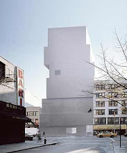
For the first assignment, we were required to draw some parti and poché drawings. I understood parti to mean the key design ideas of the building in terms of major spaces. The first parti diagram featured the 3rd level main hall and corridor combination as the major spaces and the same key room dominated on the 4th level. In section, the parti diagram demonstrated the irregularity of room placement to be the dominant idea.


Subscribe to:
Post Comments (Atom)


No comments:
Post a Comment