Tuesday, March 31, 2009

The stairs in the final model

The curved staircase has a wooden balustrade painted with the design of the texture for 'malleable' that references the spiral stairwell in the room and the curved stairs themselves. The staircase integrates with the second floor of the building. The materials used to construct the stairs are dark glass and wood stained black, which represent the theme of 'dirty'.


The spiral staircase is for the level with the keyword 'stripping' and it is as though it has been stripped back to a skeletal frame. This staircase integrates with the basement floor and relies on its central column for support. The materials used are metal and glass.


Monday, March 30, 2009

The model of the gallery and studios

Gascoigne's studio is the upstairs workroom where she can assemble and cut materials with natural light. Moffatt has the underground workroom where she can set up darkrooms and photo shoots.


Saturday, March 28, 2009

Artists' works in their studios

These images show the artists' workshops and the work in the context in which it would have been created.


Custom textures and the model

These screenshots from Sketchup show the use of custom textures taken from the drawings done during the tutorials.

I chose the texture 'symmetrical' for above ground area when thinking of Gascoigne's methods of geometric assemblage of materials. The use of this texture strip divides the open workshop into separate work areas e.g. dedicated spaces for disassembling large found materials, spaces for detailed compositioning of works and clean areas for reflecting or other activities.


I chose the texture 'malleable' for the gallery level to represent the curves of the building that have been moulded and edited. The texture does not overpower the gallery.


I chose the texture for below ground 'dimpled' because of its resemblance to film strips for film/photography that are Moffatt's mediums. I applied this texture to all of the walls to accentuate the height and ceilings of the space.

Thursday, March 26, 2009

Stairs and video

The scenes in this clip that are including stairs are from the 0:45 second mark to 2:30 mark and from 4:35 mark.


The reason that I chose this video over other clips about stairs is because of the client in my scheme. Tracey Moffatt's involvement in film as well as photography and her use of costuming, props and fantasy in her work relate to the choice of clip. I can imagine Tracey dressed as this character as she plays a strong female role. A factual film about stairs would not fit Tracey's studio. This also shows people using the stairs.

The stair 'hill' in the first scene portrays loneliness and isolation. The ramp with the screw thread style reminds me of spiral stairs (there are some in my model), and the stairs that the man finds himself at the foot of finally lead him up other stairs to the god who grants his wish. These are interesting uses of stairs as part of a narrative, just as Tracey's carefully composed scenes also narrate her ideas.

Wednesday, March 25, 2009

Sunday, March 22, 2009

The artists' materials


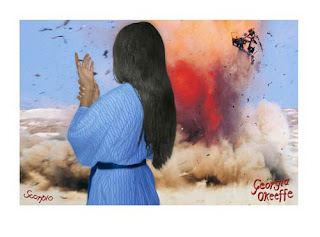
"Georgia O’Keefe" 2005 - Tracey Moffatt

For the ‘Under the Sign of Scorpio’ 2005 exhibition, Tracey Moffatt took photos of herself dressed as 40 prominent women born under the star sign of Scorpio. This particular print is of Moffatt costumed as Georgia O’Keefe - a well-known female artist of the 20th Century. The photographs were staged and worked on in her New York apartment over the 2005 winter by Moffatt and her assistant. An ordinary digital camera was used. The photographs were then edited in Photoshop and prints were editioned on rag paper. Rag paper is a fine art paper that is made of either cotton or fabric and wood fibres, is strong and is used for archiving. An edition is a series of prints produced of the one image. The edition for this image was 21.


"Untitled" - Rosalie Gascoigne

This is an untitled piece of work from a post-humus exhibition of Rosalie Gascoigne’s that included works from the early 80s until 1997. Gascoigne’s methods centre on the assemblage of found materials into ordered geometric compositions. Gascoigne has historically used natural objects; I was only aware of her works using man-made materials such as weathered wood panels, corrugated iron and other industrial materials. Gascoigne does not paint or draw and her approach to work is said to have been influenced by her history as an expert on ikebana (flower arranging). This image is not a major work of Gascoigne’s and there is very little information about it except that this particular work is made from torn linoleum on plywood.

Articles/websites referred to for blog:
'Landscape of Shards' Felicity Fenner, Art in America (Feb 1999)
'Rosalie Gascoigne: Great blond paddocks' Bronwyn Oliver Art & Australia
'Artist's choice: Rosalie Gascoigne Earth 9' Jenny Sages
Art & Australia
'Reading Tracey Moffatt' Andrea Stretton
Art & Australia
'The secret lives of Tracy Moffatt - cover story' Samantha Selinger-Morris Sydney Morning Herald 30/07/05.
http://www.roslynoxley9.com.au/news/releases/2005/07/10/94/
http://www.roslynoxley9.com.au/news/releases/2004/04/22/67/

Friday, March 20, 2009

The second sketchup model

This is a model of a section drawing with the keywords DIRTY and STRIPPING.


Sunday, March 15, 2009

The sketchup model based on the drawings


Here are the Sketchup models for the drawing below. The words that inspired the drawings were DIRTY and ROUGH.

Saturday, March 14, 2009

The 36 sections

Here are the completed 36 drawings.


Thursday, March 5, 2009

Hall, Moffat and Gascoigne


MOFFATT - debris, watching, dirty


GASCOIGNE - stamp, stripping, rough


HALL - organism, reaching, velvety

Something beautiful


This is a plastic can of beer from the plastic food district in Tokyo. The shops there contain plastic food that is used in displays outside restaurants to show potential customers what meals they serve. The foods vary by cuisine, level of realism and size. In the plastic food shop display, the lighting was carefully arranged to make the fake ice shavings sparkle realistically like melting ice. While this is an ordinary object, the light sparkling on the rubber ice is beautiful.

A great piece of architecture


I haven't actually seen this building as it is located in Santiago, Chile - I read about it in a magazine. I was very interested in the windows that the article likened to 'peepholes' through which the inhabitants could be observed, making the house a 'dynamic landscape'. I like the fact that the house has been built into the existing hill and also the brightness of the spaces. I had difficulty choosing the image that best represents the house - see the other images and the brief article here.

Examples of my work


This work was made using woodblock printing on the lower sheet and photocopy transfers on the top sheet of paper. The woodblock images are not clearly visible in the photograph but can usually be seen through the opaque top layer of Japanese paper. The assignment was to create a work 'about place' and these images are taken from personal childhood experiences in Pakistan.


This woodblock print is a self portrait representing feelings of confusion and disappointment during some travels that I had looked forward to beforehand. The paper that was used is washi (Japanese handmade paper) that my classmates and I made collectively out of plant pulp. The print has 4 layers - one layer for each colour.


This lithograph was inspired by Japanese/Chinese calligraphy which I was exposed to when living with a calligrapher in Japan and also by the Inside Out new Chinese art exhibition. I have tried writing kanji with a brush but have very poor calligraphy skills. I used a painting medium on the lithography stone, then cut back into the image which produced the white scratches in the print.