Tuesday, October 20, 2009

The study cycle at the Red Centre - animation

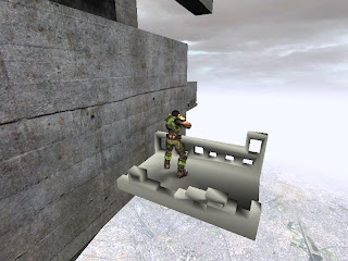
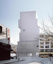
The cyclical nature of architecture study is demonstrated in this animation. The bewildered and overwhelmed students experience the uphill battle of assignments and deadlines as they move through the Red Centre. They pass Red Centre landmarks such as the gallery ramp, the stairs, the columns and the print room. The Red Centre theme of concrete is used throughout the animation. Once the students reach the copy room they come across the next back-to-back assessment and the process begins all over again. Please click the image to go to the Youtube video for this animation.

Friday, October 16, 2009

Fluid Thoughts drawings


This drawing is a blind contour drawing superimposed over an observational drawing of an interior.


This is a still life of a series of objects at home.


This painting is of an interior taken from two slightly different perspectives.


This ink drawing was done at the Museum of Sydney.


This drawing incorporates multiple perspectives, change in scale and uses charcoal and ink in combination.

Fluid Thoughts and Movements to Actions workshop

The focus of the Fluid Thoughts and Movements to Action workshop was to capture the emotive qualities of drawing spaces using the mediums of ink and charcoal. It involved the capturing of 3D space in a 2 dimensional medium. This was acheived by a developing a fluidity of thought and drawing through the use of multiple perspectives, by mixing techniques and by the use of rhythm.

Saturday, September 5, 2009

The tunnel book and the atlas of colour

The final project for the Atlas of Colour workshop was two handmade books, one with accordian style binding and the other bound as a tunnel book. I misunderstood the advice that the cutouts in the tunnel book could be 'anywhere' and created a cutout book with cutouts in differing places without a central tunnel.

download Atlas of Colour
downolad Sushi Inn tunnel book

Friday, August 21, 2009

Atlas of colours - collages of Igualada Cemetary Park

I enjoyed working on the collages for the Atlas of Colours workshop. Below are the collages for the Miralles-PinĂ³s Igualada Cemetary Park.

Elevation of the crypts at the main place:


Plan of the morgue, sacristy and service area:

Atlas of colours - precedent book and face map

A precedent book was selected and studied where the design and production was to influence the final Atlas of Colours book and the tunnel book.

Here is the analysis of El Croquis' Miralles/Pinos book as shown in my Atlas.


The contours of the precedent analysis architect's face formed an island and reef with marigold yellow topography.

Atlas of colours - marigold yellow

The Atlas of Colours workshop explored a range of themes related to colour and colour theory. Colours were assigned individually. The colour I received was a marigold yellow. I explored the assigned colour when looking at depth/landscaping.


Below are two complementary colour schemes (yellow and purple) that also explore texture.


I also applied the colour to axonometrics and architectural drawings to explore shade and tint.


Here is the colour wheel that was studied and the tones of the colour marigold.


Sunday, June 21, 2009

Link to Final Model

Please click image to go to Filefront

Sketchup model

Please click the image

Final 5 images


Madonna’s office has a recording booth in the centre where she can work on her music. The many windows represent her different fields of work in fashion, photography, music and film. The glass wall allows natural sunlight and a view of the complex and her empire.


Prada’s office includes a raised platform inspired by a catwalk where she can meet clients. The office has a corner with large windows inspired by shopfront display windows where Prada can work with natural sunlight for inspiration. The office is open plan to allow for sewing tables, racks and seating.


The glass recording studio booth.


The glass lift lobby at the meeting space.


The meeting space is intentionally spacious to promote open discussion. The windows represent the various projects of the two clients which overlap each with others’ fields. They are large to represent power. The movers at the end of the room link to the recording studio, gallery space and photography studio.


Saturday, June 20, 2009

Textures and the model

The texture 'linear' resembled creativity and femininity and was chosen for the gallery/studio spaces as creative rooms.


It was also the texture chosen for the meeting table, because of the emphasis on creativity.


The texture 'confidently' accentuates the meeting space.


The 'playful' texture was used for the 2 clients' elevators and conveys a sense of movement.

The 4 movers in the environment

The embarkation point for the mover from the meeting point to Prada's office.


The mover from Madonna's office to the meeting space.


The 2 internal movers, in the meeting space, that lead to the art gallery, photo studio and recording studio.

Thursday, June 18, 2009

Wednesday, June 17, 2009

Further drafts of the elevators

Madonna's elevator has multiple shapes that cut into and emerge from the elevator, which represent the various media and projects which she works on.


Prada's elevator is based on classical monument and is inspired by the Fondazione Prada's support of the arts.

Monday, June 1, 2009

Draft of Prada's office


Draft other rooms

The following are the basic shapes without any lighting or textures

recording studio:


meeting space:


entrance to meeting space:


art gallery:


photo studio:

Draft elevator

Draft of Madonna's office


Draft table

The draft dining table was inspired by a strong feminine curve that is decisive in its direction.